Saturday, April 14, 2018
Reflecting
Here is my reflection of this entire experience, I had a wonderful time making this magazine including the ups and downs and I learned a lot about the print world that I would have never learned in my field of study :)
Thursday, April 12, 2018


Wednesday, April 11, 2018
Two Days For My Two Page Spread
So i started working on the two page spread and i thought I should change up the color behind the close up shop because I wasn’t liking the white and blue. I narrowed it down to green, red, and aquamarine but I’m having trouble choosing which one will be the right color for the scheme.


Off the bat i didn’t like the green because 1 - I was too lazy to overlay the top and 2 - the background became pixelated very easily when I changed the color to green. I ended up deciding that blue will be the best because the red looks great but it looks like pink when I imported it into canva.
Additionally, I used part of the border used in the front page just to pop the second page a little bit. I played around with using different color text like black white and yellow, but i’m still not sure what i’ll do for that.
Tuesday, April 10, 2018
Content With My Contents
So for the table of contents Ive actually decided on using pictures and titles for articles to save space and keep a consistent format. The contents was really easy to format and I used pictures from family and friends who were kind enough to give me permission to use their pictures. My sister is on multiple dance teams so she was able to get me permission to use photos of dancers of all kinds of genres and styles from bhangra to bharat natyam. Additionally, as I mentioned before, my dad is a painter and gave me permission to take pictures of his paintings for this project.


Sunday, April 8, 2018
After All This Time
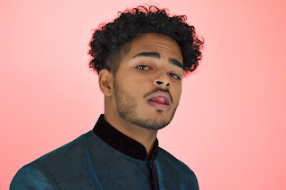
Okay I finally came around to thinking about my two page spread, And I realllllyyy like what I've done in the past hour or two. I decided to follow the Kid Cudy magazine layout because that was my original intention, AND I had this perfectly good picture of me sticking my tongue out that I can put super blown up on an entire page.
This is what I came up with so far. I started the article, but for now it's nothing to read, it's just the format for the two columns. I'm not digging the black entirely, but when I tried white and gold, it didn't seem to be very readable since the font is smaller. I might think of an alternative like a semi transparent black box for the text to go into, or change the background of the second page, and make the background of the picture blue, or even green and red as thew title is and many examples of truck painting are.

I really like the cross over of the AN' because it's just two letters and it's a unique place to put the title without making it look chopped in half. But stepping back, i'm not liking the color scheme all that much, the grey behind my face and the baby blue with black doesn't scream Indian at all. I'll need to recolor somethings, or maybe even add some portion of the golden alpona to this page to brighten the mood.
Wednesday, April 4, 2018
Prai Shesh
Alrighty, my cover is finally done. I started by choosing the side profile pic for my cover because I felt it was much brighter and more intriguing than the shit where I looked directly into the camera. I know that is contrary to convention, but I think of this as an artistic decision, not always can we follow convention to build the best product. To create the blue I actually layered two pictures that worked perfectly. I'm surprised that this bluing of the picture looks even better than the draft version we did in Photoshop. I think this is because, in Photoshop, upon editing a lower layer, the above layers are affected, which is not the case in paint.net.


After the layering, I added the border, title, and cover lines, and I actually really like how this is looking so far.

The only thing I'm wondering is if the white text will be hard to read, but I think i'll ask some peers what they think and then decide if I'll change the white to gold or black.
I really think the bus is cleanly emulated on the cover without the need for tooooooo flashy designs and vibrant colors. I just realized this too, the baby blue is also an Indian color because it is on the flag, and it is the color of India's cricket team uniform.
OOH I forgot to say this too, some peers gave me the recommendation to remove the mirror because there would be too much going on. I completely agree, after seeing the last draft, I wasn't sure if the mirroring was the right way to go, I just knew that if I tried it, I would know for sure.
Monday, April 2, 2018
We Hit Gold
So I opened up my project on Canva and began the process that i have been dreading for so long, actually formatting the entire magazine instead of it's parts, but as I began by importing the pictures that I wanted, I realized, nothing that I had was in PNG format to be edited with full transparency. And this was definitely needed for the border.
oh! I forgot to mention, My dad helped me draw a border on copy paper, and then I scanned it in black and white only to make a true masterpiece of alpona.

From here I had to download this weird software called print.net that is basically a rip off of Photoshop and Microsoft Paint. But I had to download it because I have low gas in my car and I don't know how many trips i can take between friends' houses to use Photoshop before I ran out of gas. Additionally, I was too lazy to drive to a gas station and I found this tutorial that can help me convert stuff to PNG format woo!
So, I pulled up that pic on me n I started to go HAM. Within half an hour I had this wonderful golden border that looked absolutely amazing. I kinda wanna use it on like 20 pages of the magazine now.


How To Give ANY Image a Transparent Background - Paint.Net (FREE) [Video file]. (2014, January 6). Retrieved from https://www.youtube.com/watch?v=wWPJz330VRk
oh! I forgot to mention, My dad helped me draw a border on copy paper, and then I scanned it in black and white only to make a true masterpiece of alpona.

So, I pulled up that pic on me n I started to go HAM. Within half an hour I had this wonderful golden border that looked absolutely amazing. I kinda wanna use it on like 20 pages of the magazine now.


Subscribe to:
Posts (Atom)
-
Here is my reflection of this entire experience, I had a wonderful time making this magazine including the ups and downs and I learned a lot...
-
 For my cover, I began wondering about costume designs and things of this sort. I began looking up more magazine covers of Ranveer Singh bec...
 -
 So i started working on the two page spread and i thought I should change up the color behind the close up shop because I wasn’t liking the ...