Saturday, April 14, 2018
Reflecting
Here is my reflection of this entire experience, I had a wonderful time making this magazine including the ups and downs and I learned a lot about the print world that I would have never learned in my field of study :)

Thursday, April 12, 2018


Wednesday, April 11, 2018
Two Days For My Two Page Spread
So i started working on the two page spread and i thought I should change up the color behind the close up shop because I wasn’t liking the white and blue. I narrowed it down to green, red, and aquamarine but I’m having trouble choosing which one will be the right color for the scheme.

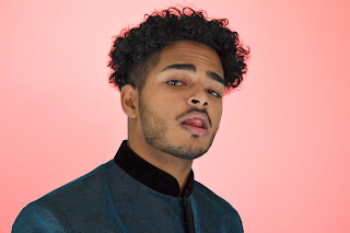
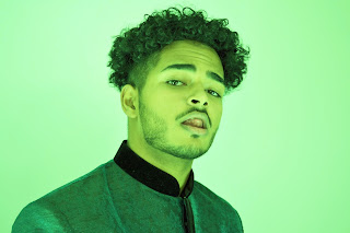
Off the bat i didn’t like the green because 1 - I was too lazy to overlay the top and 2 - the background became pixelated very easily when I changed the color to green. I ended up deciding that blue will be the best because the red looks great but it looks like pink when I imported it into canva.
Additionally, I used part of the border used in the front page just to pop the second page a little bit. I played around with using different color text like black white and yellow, but i’m still not sure what i’ll do for that.


Off the bat i didn’t like the green because 1 - I was too lazy to overlay the top and 2 - the background became pixelated very easily when I changed the color to green. I ended up deciding that blue will be the best because the red looks great but it looks like pink when I imported it into canva.
Additionally, I used part of the border used in the front page just to pop the second page a little bit. I played around with using different color text like black white and yellow, but i’m still not sure what i’ll do for that.
Tuesday, April 10, 2018
Content With My Contents
So for the table of contents Ive actually decided on using pictures and titles for articles to save space and keep a consistent format. The contents was really easy to format and I used pictures from family and friends who were kind enough to give me permission to use their pictures. My sister is on multiple dance teams so she was able to get me permission to use photos of dancers of all kinds of genres and styles from bhangra to bharat natyam. Additionally, as I mentioned before, my dad is a painter and gave me permission to take pictures of his paintings for this project.


Sunday, April 8, 2018
After All This Time
Okay I finally came around to thinking about my two page spread, And I realllllyyy like what I've done in the past hour or two. I decided to follow the Kid Cudy magazine layout because that was my original intention, AND I had this perfectly good picture of me sticking my tongue out that I can put super blown up on an entire page.
This is what I came up with so far. I started the article, but for now it's nothing to read, it's just the format for the two columns. I'm not digging the black entirely, but when I tried white and gold, it didn't seem to be very readable since the font is smaller. I might think of an alternative like a semi transparent black box for the text to go into, or change the background of the second page, and make the background of the picture blue, or even green and red as thew title is and many examples of truck painting are.

I really like the cross over of the AN' because it's just two letters and it's a unique place to put the title without making it look chopped in half. But stepping back, i'm not liking the color scheme all that much, the grey behind my face and the baby blue with black doesn't scream Indian at all. I'll need to recolor somethings, or maybe even add some portion of the golden alpona to this page to brighten the mood.
This is what I came up with so far. I started the article, but for now it's nothing to read, it's just the format for the two columns. I'm not digging the black entirely, but when I tried white and gold, it didn't seem to be very readable since the font is smaller. I might think of an alternative like a semi transparent black box for the text to go into, or change the background of the second page, and make the background of the picture blue, or even green and red as thew title is and many examples of truck painting are.

I really like the cross over of the AN' because it's just two letters and it's a unique place to put the title without making it look chopped in half. But stepping back, i'm not liking the color scheme all that much, the grey behind my face and the baby blue with black doesn't scream Indian at all. I'll need to recolor somethings, or maybe even add some portion of the golden alpona to this page to brighten the mood.
Wednesday, April 4, 2018
Prai Shesh
Alrighty, my cover is finally done. I started by choosing the side profile pic for my cover because I felt it was much brighter and more intriguing than the shit where I looked directly into the camera. I know that is contrary to convention, but I think of this as an artistic decision, not always can we follow convention to build the best product. To create the blue I actually layered two pictures that worked perfectly. I'm surprised that this bluing of the picture looks even better than the draft version we did in Photoshop. I think this is because, in Photoshop, upon editing a lower layer, the above layers are affected, which is not the case in paint.net.


After the layering, I added the border, title, and cover lines, and I actually really like how this is looking so far.

The only thing I'm wondering is if the white text will be hard to read, but I think i'll ask some peers what they think and then decide if I'll change the white to gold or black.
I really think the bus is cleanly emulated on the cover without the need for tooooooo flashy designs and vibrant colors. I just realized this too, the baby blue is also an Indian color because it is on the flag, and it is the color of India's cricket team uniform.
OOH I forgot to say this too, some peers gave me the recommendation to remove the mirror because there would be too much going on. I completely agree, after seeing the last draft, I wasn't sure if the mirroring was the right way to go, I just knew that if I tried it, I would know for sure.
Monday, April 2, 2018
We Hit Gold
So I opened up my project on Canva and began the process that i have been dreading for so long, actually formatting the entire magazine instead of it's parts, but as I began by importing the pictures that I wanted, I realized, nothing that I had was in PNG format to be edited with full transparency. And this was definitely needed for the border.
oh! I forgot to mention, My dad helped me draw a border on copy paper, and then I scanned it in black and white only to make a true masterpiece of alpona.

From here I had to download this weird software called print.net that is basically a rip off of Photoshop and Microsoft Paint. But I had to download it because I have low gas in my car and I don't know how many trips i can take between friends' houses to use Photoshop before I ran out of gas. Additionally, I was too lazy to drive to a gas station and I found this tutorial that can help me convert stuff to PNG format woo!
So, I pulled up that pic on me n I started to go HAM. Within half an hour I had this wonderful golden border that looked absolutely amazing. I kinda wanna use it on like 20 pages of the magazine now.


How To Give ANY Image a Transparent Background - Paint.Net (FREE) [Video file]. (2014, January 6). Retrieved from https://www.youtube.com/watch?v=wWPJz330VRk
oh! I forgot to mention, My dad helped me draw a border on copy paper, and then I scanned it in black and white only to make a true masterpiece of alpona.

So, I pulled up that pic on me n I started to go HAM. Within half an hour I had this wonderful golden border that looked absolutely amazing. I kinda wanna use it on like 20 pages of the magazine now.


Saturday, March 31, 2018
Not So Golden Idea
So I decided that I'll finish the border before I move on to working on my other two components for this magazine. I wasn't able to get my dad or anyone else to do a design for me, so as always I'll be doing this myself. I have never done alpona designs before but i think what i drew came out well to work with, but I might have to redraw it if it doesn't look good in gold. Below is my original drawing.

When scanning the picture it seem more childish, but I put both the golden and the black next to each other to see how they look and which one might work better. But as I look at it now I'm not liking it too much. It may be because i drew it in sharpie, or because my hand isn't as skilled as a real painter or artist. Regardless, the result is not satisfying and I will need another way to do this correctly.


When scanning the picture it seem more childish, but I put both the golden and the black next to each other to see how they look and which one might work better. But as I look at it now I'm not liking it too much. It may be because i drew it in sharpie, or because my hand isn't as skilled as a real painter or artist. Regardless, the result is not satisfying and I will need another way to do this correctly.


Additionally, it's time I decided on a format for my table of contents. I think i will do two columns, one with features and the other with common content, and I may do a third column for pictures that relate to these articles. The most important thing to me is that the table of contents is clean and easy to read, because imposing the AWAZ DO style will be much harder if the format is very busy or hard to decipher.
Thursday, March 29, 2018
Cover Cover Cover
Alright so at this point I'm ready to start messing with some actual layouts for the cover and I came up with this one with one of the pictures. Below is a small draft with the correct color scheme but not font or border on the front. I really think it'll pop once I put those two in but I'm now considered whether I should put at least one or two cover lines as Platform or Fader would, just so I can have something for the audience to read on the cover when this cover catches their eye.

Additionally, I spent about four or five hours changing the color of every pixel on the AWAZ DO title font and was able to make a picture, it's not completely done because it is tedious work, but once I finish the incomplete letter, I will be able to use this title above in my cover.

At this pint I'm realizing that I'm spending wayyyy too much time on the cover, and not as much time on the table of contents or the two page spread. It won't be that hard to write my article because I won't need to interview anyone else. But the table of contents I'm still having a total blank out on what I can do or even should do. I originally intended on making the table of contents a map of India, and each article would have a small arrow to the state that the article pertains to, but I know that will be too complicated, not look nice, and not take account for any article that is not pertaining to a certain region of India.
Right now I'm exhausted from editing the title font, I'm not so sure If i should put as much effort into the rest of the magazine as I did with the cover. I definitely know I did unnecessary work and I know I can bring the same quality in product without this amount of strenuous diligence.

Additionally, I spent about four or five hours changing the color of every pixel on the AWAZ DO title font and was able to make a picture, it's not completely done because it is tedious work, but once I finish the incomplete letter, I will be able to use this title above in my cover.

At this pint I'm realizing that I'm spending wayyyy too much time on the cover, and not as much time on the table of contents or the two page spread. It won't be that hard to write my article because I won't need to interview anyone else. But the table of contents I'm still having a total blank out on what I can do or even should do. I originally intended on making the table of contents a map of India, and each article would have a small arrow to the state that the article pertains to, but I know that will be too complicated, not look nice, and not take account for any article that is not pertaining to a certain region of India.
Right now I'm exhausted from editing the title font, I'm not so sure If i should put as much effort into the rest of the magazine as I did with the cover. I definitely know I did unnecessary work and I know I can bring the same quality in product without this amount of strenuous diligence.
Tuesday, March 27, 2018
I Get My Blue
I sat down with two SD cards full of hundreds of photos and began narrowing them down. I was very surprised at how amazing these pictures came out but there was a big problem: it is quite obvious that I'm not a model when I am looking directly into the camera. Most of the shot that I did not delete were of profiles or me looking off to the side. I'm not sure if a cover photo looking directly at the audience has the same effect when the model looks uncomfortable. Anyways, I decided I would just narrow down the photos and choose from there whether it was a profile or a front facing shot. Here are how some of the shots came out, I was really happy with these pictures' quality.


Blake Repp, my photo specialist, told me that we can work together on photoshop to edit these pictures properly. I still had some concerns about how to make the background blue in these shots, and whether I would do it or not. So we began by editing a draft picture and just playing around in the program. Blake was able to connect his laptop to a Television screen so we can easily see the picture in a bigger frame and with a brighter backlight.

When we sat down and tried working the program, Blake showed me an interesting layering technique where he cuts out a part of the photo and is able to edit solely that piece over the entire photograph. I immediately thought that this can be used to change the hue and temperature of solely the background while the front remains completely intact. The result is subtle but I think this will work perfectly for my magazine. I finally found a way to incorporate light blue.


Blake Repp, my photo specialist, told me that we can work together on photoshop to edit these pictures properly. I still had some concerns about how to make the background blue in these shots, and whether I would do it or not. So we began by editing a draft picture and just playing around in the program. Blake was able to connect his laptop to a Television screen so we can easily see the picture in a bigger frame and with a brighter backlight.

When we sat down and tried working the program, Blake showed me an interesting layering technique where he cuts out a part of the photo and is able to edit solely that piece over the entire photograph. I immediately thought that this can be used to change the hue and temperature of solely the background while the front remains completely intact. The result is subtle but I think this will work perfectly for my magazine. I finally found a way to incorporate light blue.

Sunday, March 25, 2018
The Aluminum Shoot
So, today I got together with Blake Repp and began shooting higher quality pictures with him for the front cover. But before we started to shoot, I realized that my makeshift studio did not have enough light. I then decided to add another light bulb to bounce off one of the reflectors. This brightened the area in front of the projector screen but did not bring it to the brightness that I wanted. I then thought that maybe my reflectors are absorbing light from the bounce off because they're not professional equipment. I tried putting aluminum foil on my reflectors to bounce off more light with the least amount of change in set up.


By adding this reflective metal, my makeshift set up had more light than before. At this time I was completely prepared for Blake to come to the studio.
I asked Blake to bring his Nikon camera. He brought the camera and his laptop so we can view the pictures on a brighter and bigger screen before we move on to different set ups or even shots outside.


Since I am not a professional model, I tried my best to not look awkward in the photos. It took me a while to realize, but by just acting as myself, I was able to become comfortable and intimate with the camera. We took one set of shots on Blake's SD card and another set on mine. When we finished, we weren't able to take any pictures outside because the sky was looking gloomy. But nonetheless, we reviewed the lighting and quality of the pictures on Blake's laptop, with a little less of looking for composition and pose and more focused on whether the light hit my face at the right angle and whether the shadows were visible or not, we decided the the photos were usable and we were going to review them and narrow them down for the magazine later.
Friday, March 23, 2018
Borders Up
So I was planning on doing the baby blue and gold color scheme for everything and I've already designated the background to be blue, but I have not yet decided what I wanted to be yellow on the cover. I was originally thinking a yellow border around the entire cover, but I think that alludes more to National Geographic's signature hollow rectangle as seen literally all over their website. So, when I hit this dilemma I immediately thought alpona or mehindi designs around the border would be perfect for the situation.
Think of an eye catching motif like the Nat Geo covers but with a design instead of a gold border:

Alright so I asked my sister what alpona called in English, and she said the closest thing is henna. Henna designs are actually really popular in the United States and they are basically drawn temporary tattoos. What most people don't know is that these designs are also used in fashion design, painted in various forms of art, and even carved into Indian furniture. These line drawing designs are signature to West/South Asia and will be perfect for my gold borderlines.
My dad is an artist and I asked him to draw a draft of what a border could be for the cover and another friend, who did this project last year was keen on including a very helpful tutorial in her blog. This tutorial explains how to convert ink blotches into the program to use as designs. I can manipulate the same concept to convert drawings into the program to use as a high quality border. With this tutorial, I think I will have to use Photoshop to create the colors and flowing style that I want in these border designs. At least for the cover that is.
Think of an eye catching motif like the Nat Geo covers but with a design instead of a gold border:

Alright so I asked my sister what alpona called in English, and she said the closest thing is henna. Henna designs are actually really popular in the United States and they are basically drawn temporary tattoos. What most people don't know is that these designs are also used in fashion design, painted in various forms of art, and even carved into Indian furniture. These line drawing designs are signature to West/South Asia and will be perfect for my gold borderlines.
My dad is an artist and I asked him to draw a draft of what a border could be for the cover and another friend, who did this project last year was keen on including a very helpful tutorial in her blog. This tutorial explains how to convert ink blotches into the program to use as designs. I can manipulate the same concept to convert drawings into the program to use as a high quality border. With this tutorial, I think I will have to use Photoshop to create the colors and flowing style that I want in these border designs. At least for the cover that is.
References
Explore 130 Years of National Geographic Covers in Just Two Minutes. (n.d.). Retrieved from http://www.gizmodo.co.uk/2018/01/explore-130-years-of-national-geographic-covers-in-just-two-minutes/
How to make a magazine cover [Photoshop & InDesign]. (2015, April 28). Retrieved from https://www.youtube.com/watch?v=vRrsr6CSmnY
National Geographic: Stories of Animals, Nature, and Culture. (n.d.). Retrieved from https://www.nationalgeographic.com/
Wednesday, March 21, 2018
DESIgruntled Head Shots
This post is all about setting up my shot for the cover. I started taking pictures for the cover with a phone just to see how the lighting works and if I was truly getting a clean white background. Below are some no so amused pictures of me standing in front of the lights and the white backdrop.


I like how the background came out straight white without any hard shadow showing but i feel as though it may be a little too dark. I'm going to see if post-editing one of these pictures will make them seem brighter. Another thing is that learned about mirrors today. I think the shots look much cooler when I put them through some sort of mirror filter. Additionally, I thought this could further allude to Indian/West Asian aesthetic of symmetry. Historically, the Mogul Empire - which once ruled over India at it's most east - believed symmetry should be in all work, this is the reason that many great Indian art forms have passed down the need for symmetrical shapes and figures - like the Taj Mahal which identical from all four directions.
Here's an example of a picture edited by me. These photos are still taken with a phone. This coming week, I will shoot and edit higher quality pictures with my friend Blake Repp for the cover, table of contents, and two page spread.


I like how the background came out straight white without any hard shadow showing but i feel as though it may be a little too dark. I'm going to see if post-editing one of these pictures will make them seem brighter. Another thing is that learned about mirrors today. I think the shots look much cooler when I put them through some sort of mirror filter. Additionally, I thought this could further allude to Indian/West Asian aesthetic of symmetry. Historically, the Mogul Empire - which once ruled over India at it's most east - believed symmetry should be in all work, this is the reason that many great Indian art forms have passed down the need for symmetrical shapes and figures - like the Taj Mahal which identical from all four directions.
Here's an example of a picture edited by me. These photos are still taken with a phone. This coming week, I will shoot and edit higher quality pictures with my friend Blake Repp for the cover, table of contents, and two page spread.

Monday, March 19, 2018
My Project Goes To Tatti
This post is for how I wasted my entire day and actually took a step back.
I found out that my favorite font is nowhere to be found and every downloadable link I found - if any - was a .esp file.
I researched what this meant and apparently it is a three dimensional file that has multilayered pictures like a GIS. I'm guessing this is because of the three dimensional look of the font and the fact that it is more than one color. I started looking for other fonts and I found a hand painter who sells his various fonts with an Indian truck design touch to them, but from this article, I realized even if I bought these fonts, I would still be left with only .esp files due to the NINE multi layers encompassed in his hand painted fonts.
I couldn't find any similar font so I then decided to try to use an image of the Tatti font and crop the letters together. I began by downloading a GIF of all the letters being displayed, I did this because this was the only instance I found of all the letters with solid backgrounds. With this GIF, I did a split to extrat every frame of the image so I can have access to all the letters.

I saved the letters that I needed but they were all in different colors.
 I tried to open these pictures up in paint and change them to the green and red theme that I was hoping for my magazine, but I quickly realized that many of the pixels are different colors even though the image looks solid. Additionally, the Z was not a solid color, and therefore I had no idea how to change the colors to my choosing. I ended with a horrid result that looked like this.

I found out that my favorite font is nowhere to be found and every downloadable link I found - if any - was a .esp file.
I researched what this meant and apparently it is a three dimensional file that has multilayered pictures like a GIS. I'm guessing this is because of the three dimensional look of the font and the fact that it is more than one color. I started looking for other fonts and I found a hand painter who sells his various fonts with an Indian truck design touch to them, but from this article, I realized even if I bought these fonts, I would still be left with only .esp files due to the NINE multi layers encompassed in his hand painted fonts.
I couldn't find any similar font so I then decided to try to use an image of the Tatti font and crop the letters together. I began by downloading a GIF of all the letters being displayed, I did this because this was the only instance I found of all the letters with solid backgrounds. With this GIF, I did a split to extrat every frame of the image so I can have access to all the letters.

I saved the letters that I needed but they were all in different colors.


At this point I don't know what to do because the only popping part of this project is that I found this font, everything else conforms to what many of the other students are doing with their projects regarding style, target audience, and even genre. Additionally, my doubts have solidified when helping others who struggle with their film projects. I may be better at conveying a message through film than through print media, but I will have to continue trying this route for it is what I chose as best fit for myself.
References
Alphabet [Font GIF]. (n.d.). Retrieved from https://mir-s3-cdn-cf.behance.net/project_modules/disp/faf96922044197.5630bb0ecabf0.gif
Breaking down the Indian roadside painter’s font. (2012, April 17). Retrieved from https://niranjana.wordpress.com/2012/04/09/breaking-down-the-indian-roadside-painters-font/
Saturday, March 17, 2018
A Color Pallete for My Canva
As I continued my production, I found that working with Canva might work better than inDesign. I tried working with inDesign but the program seemed very confusing. Additionally one of my friends is using Canva and she is doing a magazine about fashion with social commentary, which can be comparable to the layout of mine because both have to do with entertainment and the arts. I started looking at Canva tutorials, but I’m worried about having to import the specific font that I need for my titles and sub-headings. This font is essential to creating an allusion to the indian government bus. I’m not sure how to import this font through the online interface.
Okay I found a tutorial pretty easily on how to import the font. I was able to do this with ease and now I have no font-based worries.
I have also decided on my color pallete. Below I have attached a photo with the different colors I’d like to use.

I think everything’s coming together, all I have to do is make my final product. But one thing might have to change about my photo booth/studio. I wanted the light blue above to be the background for my cover photo, but for now the background is completely white. I’m not sure how to approach this, wherever I need blue colored lights or an actual physical blue background. I need to do more research before taking my first photo shoot for the front cover.
Okay I found a tutorial pretty easily on how to import the font. I was able to do this with ease and now I have no font-based worries.
I have also decided on my color pallete. Below I have attached a photo with the different colors I’d like to use.

I think everything’s coming together, all I have to do is make my final product. But one thing might have to change about my photo booth/studio. I wanted the light blue above to be the background for my cover photo, but for now the background is completely white. I’m not sure how to approach this, wherever I need blue colored lights or an actual physical blue background. I need to do more research before taking my first photo shoot for the front cover.
References
Graphic Design Tutorials By Canva. (n.d.). Retrieved from https://www.canva.com/learn/design/tutorials/
How To Find and Upload Fonts To Canva. (2017, October 19). Retrieved from https://kimgarst.com/how-to-find-and-upload-fonts-to-canva
Thursday, March 15, 2018
Costume DESIgn
For my cover, I began wondering about costume designs and things of this sort. I began looking up more magazine covers of Ranveer Singh because I love most of the photos taken of him and his style is bold and noticeable anywhere. While looking at these covers I noticed that in many cases he's not wearing traditional clothes. He usually wears suits and western clothing in these shots, but it's his pose that is more bold. Usually I would conform to the convention, but in this case I really wanst feeling western clothes on my Indian culture magazine. I decided to compromise and use an Indian style suit.
It took me a day, it I was able to find four Indian style suits. My guess for now is that I will shoot with all four and see which pictures come out the best, but I'm leaning toward putting the aquamarine suit for the cover and the others for the two page spread.
I still haven't planned anything for my table of contents but I want to take some abstract pictures and see if I get any ideas from there.
Below are the four suits I am planning to shoot my cover/two page spread with.

It took me a day, it I was able to find four Indian style suits. My guess for now is that I will shoot with all four and see which pictures come out the best, but I'm leaning toward putting the aquamarine suit for the cover and the others for the two page spread.
I still haven't planned anything for my table of contents but I want to take some abstract pictures and see if I get any ideas from there.
Below are the four suits I am planning to shoot my cover/two page spread with.

References
V A N I 💖. (2016, December 8). The Outliers: Man of the Year Ranveer Singh covers Man's World magazine. Retrieved from https://www.pinterest.com/pin/337207090835577251/
Tuesday, March 13, 2018
Lighting Up
So I sat down and decided that I need to start working on my production. And the first thing I'll need is a photoshoot.
bUt I doNt know how to take photos...
So I looked up a ton of video on how to set up a mini photo booth in my house and I actually came across this really interesting video on how to make cheap lighting set ups for music videos. Then i came across the definition of hard light and soft light and even an article that explained it to me.
At this point I decided that I was ready to make my in home studio. I actually have a recording studio at home which is the perfect location to set up camp. I moved all my instruments out of the room and put up blankets over the windows (because there are no blinds) and set up this really nifty thing in front of my projector screen. A visualization might make more sense than just explaining it.


bUt I doNt know how to take photos...
So I looked up a ton of video on how to set up a mini photo booth in my house and I actually came across this really interesting video on how to make cheap lighting set ups for music videos. Then i came across the definition of hard light and soft light and even an article that explained it to me.
At this point I decided that I was ready to make my in home studio. I actually have a recording studio at home which is the perfect location to set up camp. I moved all my instruments out of the room and put up blankets over the windows (because there are no blinds) and set up this really nifty thing in front of my projector screen. A visualization might make more sense than just explaining it.


I was able to replicate a soft light style thing and ended up with really high quality results. Here are two pictures of my hand with the original light in my room versus the studio lighting I set up.


I really liked the results, hopefully with some editing skills I can make my front cover portrait look amazing.
References
6 Cheap Music Video Lighting Setups (ONLY $30!) [Video file]. (2017, February 28). Retrieved from https://www.youtube.com/watch?v=Tt4tMGDK5mM&t=210s
Canvas Prints - Print Photos on Canvas | Canvas Press. (n.d.). Retrieved from http://www.canvaspress.com/#sthash.9TpPDb1e.dpbs
How to Light for Close Up Product Shots & Reviews. (2016, June 24). Retrieved from https://www.youtube.com/watch?v=x3o2e5efn00
Sunday, March 11, 2018
Wot in Subscription
Because my magazine has such a specific audience, I will need a way to distribute a niche product efficiently. Some of my conventions may even change based on how I decide to distribute.
My magazine targets Indian Americans and Indian Europeans from young adults to adults, I feel as though This magazine may target men better than women because it's content and because I am modeling some of my conventions after The Fader which has a 75% male and 25% female audience.
I've decided that distributing through subscription will be my best bet. I was thinking that distribution through book stores will also be viable. I will not make my magazine available through pharmacy check out points because this magazine does not appeal to the majority of the population. Instead, I will make my magazine available in Indian grocery stores throughout large and small eastern grocery chains in the USA and Europe. Additionally, AWAZ DO will be available at cultural conferences and conventions such as the annual NABC for Bengali Indians.

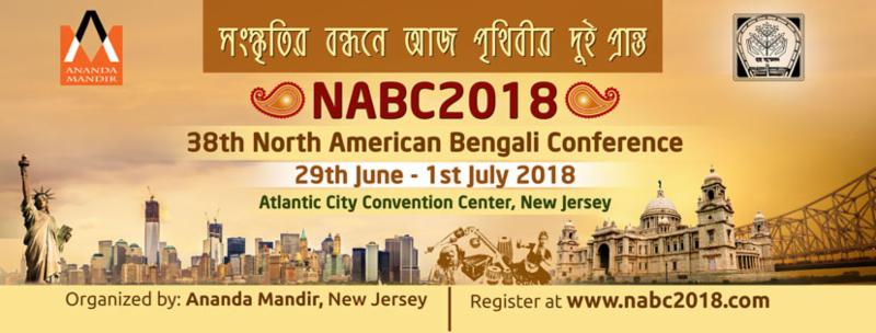
Because AWAZ DO will primarily be for subscriptions, I will use a minimum of cover lines. This is perfect because personally, I'm a fan of minimalist designs. I want the subject on the cover to catch the attention of the potential reader and I want the bus alluding design to do the same. Platform loves to do this on their front covers as well.


References
FADER MEDIA | Print. (n.d.). Retrieved from http://advertising.thefader.com/platforms/print/
House of Gharats blends cultures – Platform Magazine. (2016, September 1). Retrieved from http://www.houseofgharats.com/house-of-gharats-blends-cultures-platform-magazine/
House of Gharats blends cultures – Platform Magazine. (2016, September 1). Retrieved from http://www.houseofgharats.com/house-of-gharats-blends-cultures-platform-magazine/
NABC 2018 | North America Bengali Convention. (n.d.). Retrieved from https://www.nabc2018.com/about/nabc2018
Friday, March 9, 2018
Bollyshop
PHOTOSHOP - This is where I gotta figure out how to use this program to make the best pictures possible. I've only used photoshop a few times for my band stuff but that was just screwing around. Today, I started sitting down and looking at tutorials to see what kind of pictures I'm going to need to take versus what kind of after effects I'm going to have to use to bring those pictures to life. I think this is just a thing that I'll get the hang of over time.
On the other hand, I've been drawing inspiration from one of my friends. Hanna made a two page spread for my band a while back and I've been looking at some of the conventions she used to kinda mold my project into a masterpiece. One of the videos she used really struck me and I know, after watching it myself, that I am now more sure on how to approach my layout. Although I was set on using the text wrap, I think I need to take in consideration of how well people will be able to read it versus it's actual look. I think I'll have to play around with the design before being 100% sure that I'll use this formatting technique. Also I loved how the video used examples and just pointed out the conventions with a tin y mouse followed by a yellow circle so I can visualize them on real industry layouts.

And on another note, I'm pretty much a lonely boy. Most of the artists in my collective aren't available soon to do photo shoots and interviews for the two page spread, so I guess I'll be interviewing myself for this one. No worries, I have a ton of ethnic wear from my country of origin for costume and all I gotta do now is find some buddies to help me with stage design and camera work.
References
On the other hand, I've been drawing inspiration from one of my friends. Hanna made a two page spread for my band a while back and I've been looking at some of the conventions she used to kinda mold my project into a masterpiece. One of the videos she used really struck me and I know, after watching it myself, that I am now more sure on how to approach my layout. Although I was set on using the text wrap, I think I need to take in consideration of how well people will be able to read it versus it's actual look. I think I'll have to play around with the design before being 100% sure that I'll use this formatting technique. Also I loved how the video used examples and just pointed out the conventions with a tin y mouse followed by a yellow circle so I can visualize them on real industry layouts.

And on another note, I'm pretty much a lonely boy. Most of the artists in my collective aren't available soon to do photo shoots and interviews for the two page spread, so I guess I'll be interviewing myself for this one. No worries, I have a ton of ethnic wear from my country of origin for costume and all I gotta do now is find some buddies to help me with stage design and camera work.
References
Introduction to Magazine layouts.mp4 [Video file]. (2010, November 8). Retrieved from https://www.youtube.com/watch?v=t4JBuCSgbZw&app=desktop
x
Wednesday, March 7, 2018
inDESIgn
All these ideas are great, but I don't want the quality of my magazine to deviate from my intended formatting. So I decided to take some time to look up software and what nots that could help me produce this magazine. My only current experience with photo editing is when I make small digital posters or promotional pictures for my band. Most of these are done on obscure free editing software that I found online, but I think i need to find something of better substance to produce a nicely formatted magazine concept.
I found that inDesign may be a good way to go because I already know so many people who know how to use it and I can always bother them if i need help instead of ravaging through countless tutorial videos and wikihow searches. The thing is that my cover and two page spread do not have any crazy edits on them and the way I am planning it involved very less editing tools other than overlay/underlay, text wrap, and the input of my specific font.
I wanted to make sure that inDesign can do the text wrapping for my two page spread. And after looking, I found that it's actually super easy to wrap text in this program.

I found that inDesign may be a good way to go because I already know so many people who know how to use it and I can always bother them if i need help instead of ravaging through countless tutorial videos and wikihow searches. The thing is that my cover and two page spread do not have any crazy edits on them and the way I am planning it involved very less editing tools other than overlay/underlay, text wrap, and the input of my specific font.
I wanted to make sure that inDesign can do the text wrapping for my two page spread. And after looking, I found that it's actually super easy to wrap text in this program.

I also found that Adobe has a lil help center that explains literally every little function on inDesign. That is super convenient.
References
Learn how to wrap text around objects in InDesign. (n.d.). Retrieved from https://helpx.adobe.com/indesign/using/text-wrap.html
Subscribe to:
Posts (Atom)
-
Here is my reflection of this entire experience, I had a wonderful time making this magazine including the ups and downs and I learned a lot...
-
 For my cover, I began wondering about costume designs and things of this sort. I began looking up more magazine covers of Ranveer Singh bec...
 -
 So for the table of contents Ive actually decided on using pictures and titles for articles to save space and keep a consistent format. The ...